Creating a specific digital annual report gives nonprofits a number of options to showcase the great work their donors have enabled them to do. Digital annual reports give you an expanded set of capabilities that a PDF or Issuu (flip book style) annual report can’t match such as video, animation, interactive elements, expanded information for those interested, and more. I scoured the web for the best examples of digital nonprofit annual reports to give you inspiration as you’re developing yours.
You can continue reading or skip all of my pontificating about why these annual reports are great. Here’s the list of links to the digital nonprofit annual reports for you to see yourself:
- Girls Who Code
- Child Mind Institute
- Tableau Foundation
- Save the Children
- Museum of Fine Arts Boston
- Girls, Inc
- Gates Foundation
- Pencils of Promise
1. Girls Who Code
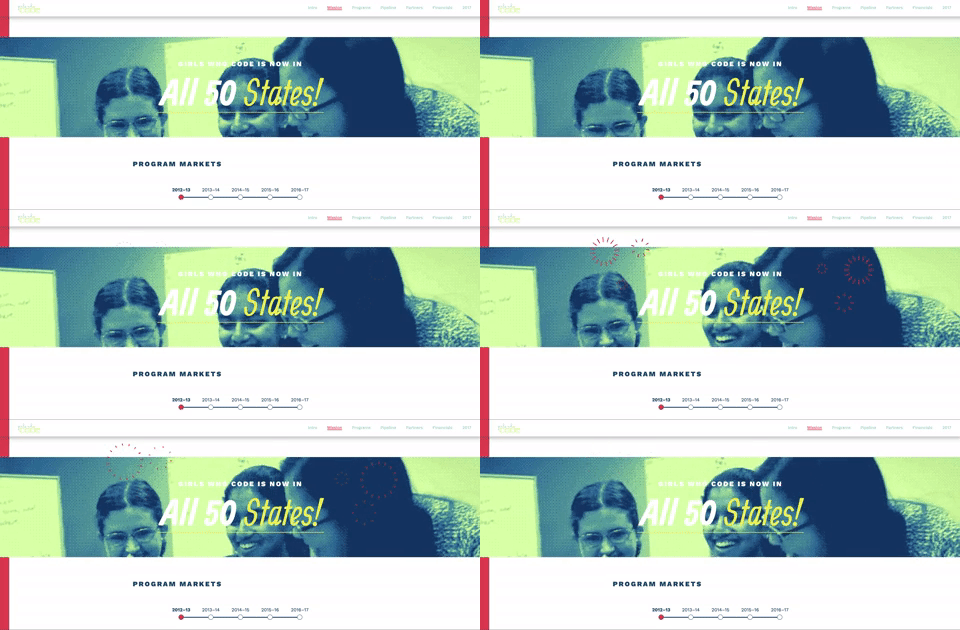
What’s not to love about this beautiful digital annual report? Wisely combining background videos, animations, animated gifs, easy and clear infographics, the Girls Who Code digital annual report clearly tells the story of their year.
There’s considerable thought in the user experience of the annual report. As your scroll down, notice how animation elements are used to draw your eyes to different places on the page. The timing of the animation helps draw you further down the page as you’re reading.
Lesson: don’t be afraid to use animation and video, but do so in a way that supports the reading flow of the annual report.
2. Child Mind Institute
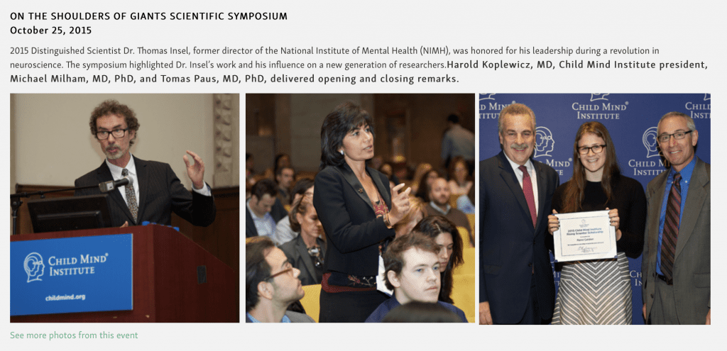
The Child Mind Institute isn’t the flashiest digital annual report, but it connects well with supporters.
One of the most effective areas of the annual report is the “year in pictures” where Child Mind Institute tells stories of the year through a couple of candid photos. This helps the supporter (or potential supporter) see the people who are involved in the organization and begin to feel like they know them.
Lesson: don’t hold back on the visual elements of your annual report and use a lot of story telling.
3. Tableau Foundation
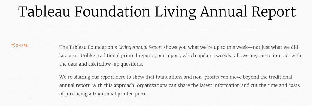
One of the more unique annual reports on this list isn’t an annual report at all, instead Tableau Foundation has created a weekly dashboard for donors to keep up with the goings on of the organization. This is a data intensive effort, but from a foundation for a business intelligence company, it makes sense. I love the transparency of publishing your data for the world to see with a weekly report.
Lesson: be transparent with your supporters.
4. Save the Children
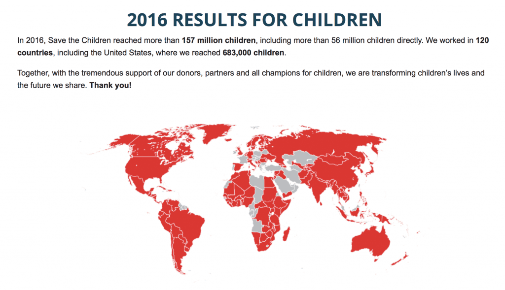
Save the Children gives us an important lesson as we prepare our annual reports. Though it is not a full digital immersive experience, the index page for the annual report has key information pulled out for the reader. Many of the nonprofits I reviewed simply had a link to their annual report with no context or important information giving the link context.
Lesson: if you opt to produce only a PDF annual report, pull out key information from your annual report and place it on the download page to give the reader information before they dive in.
5. Museum of Fine Arts Boston
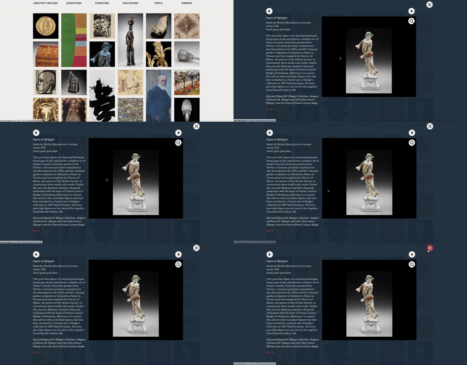
The Museum of Fine Arts Boston annual report takes advantages of the inherit benefit of providing more information in a digital annual report. Throughout the pages of this annual report, you’ll find stories of their acquisitions and exhibits.
Lesson: if you have detail to share, you don’t have to include it all on one page, you can always add extra detail for those who want to know more.
6. Girls, Inc.
Wow, this annual report is pink. But it’s also very much on brand and smartly incorporates video and animations into the annual report. The annual report also wisely includes links to the organization in the press (increasing your trust) and stories about how you’re making a difference as a donor.
Lesson: you can still stay on brand with your digital annual report, you don’t need to fit into some template you buy. Be yourself but add some interactive elements.
7. Gates Foundation
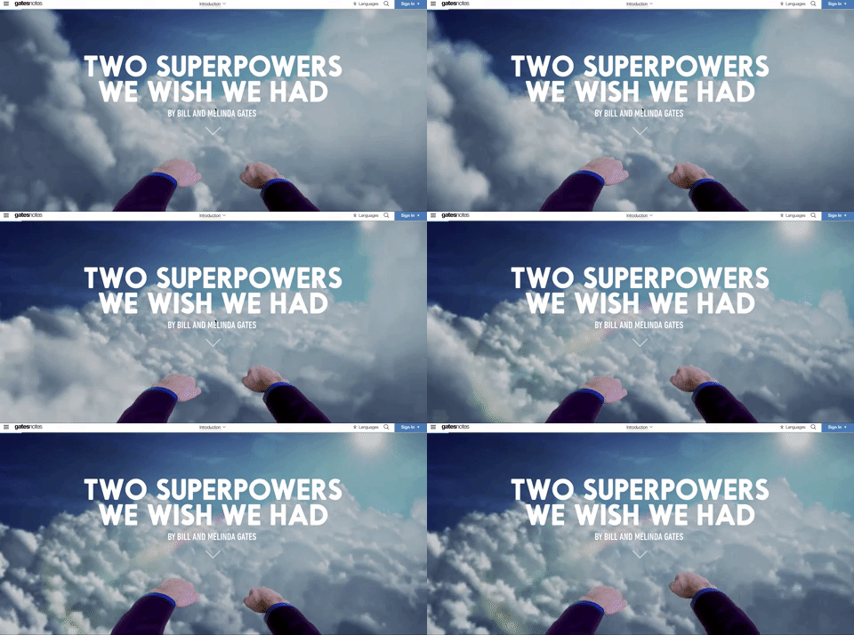
The Gates Foundation has a creative take on the annual report in the form of an annotated letter. They incorporate video and call to action throughout the piece. This isn’t simply an annual report converted to a digital form but instead a new type of annual report that takes advantage of a different channel.
Lesson: you don’t have to take the page turning concept of the PDF or print annual report and directly copy it for the web. Stretch your thinking to how you can best fit the channel and your readers.
8. Pencils of Promise
Pencils of Promise created a beautiful annual report that wisely uses infographics and charts to tell the story of the previous year. On the surface, it’s a simple looking annual report, but underneath it’s simple because it’s so well designed and the layout is so efficient.
Lesson: sometimes simple is better. The Pencils of Promise isn’t the flashiest annual report, but it clearly and concisely tells the nonprofit’s story to the reader.
